Sunday, December 18, 2011

Assignment #8- Cubism & Pablo Picasso


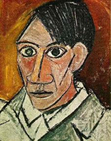
Pablo Picasso
 (Spanish, 1881-1973)
http://www.artquotes.net/masters/picasso/pablo_selfport1907.htm

* What captures your eye about this image? What do you like about the image?
- I like the face and the style of painting really captures my eye, I like how he used cubism to show his own face in a different perspective.

* What visual elements (the basic things that can be seen)? What details are shown in the image? What do you see?
- There is some 3D done on the nose cause it looks viewable from more then on perspective, The lines are also really thick, and I can see the extensive detail.

* What colors are used in this image? What type of emotions do the colors portray? Where are the specific colors located on the image that give off a specific emotion.
- The main colors that really stick out are orange, gray, and brown, these colors give me a dull and boring emotion, the orange and brown are in the background and the gray is found on the portrait part.

*What are the specific Elements of Art (Line, Color, Texture, Shape, Form, Size) is being shown in this image?
- The colors are pretty dull, and the texture is Oil Pastel it also looks kind of rough and old looking.

*What are the specific Principles of Design (Center of Interest, Balance, Harmony, Contrast, Directional Movement, and Rhythm) are show in the image?
- A specific principle of design would be the Center of Interest which is Picasso himself, he's the most interesting in this painting.

* How will this work of art influence your own Picasso Portrait? What specific Elements of Art and Principles of Design on this work will influence your own work?
- I will try to not make it as boring as this piece and use more colors and exciting features.
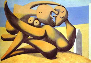


FIGURES ON A BEACH
(1931)
http://www.pablo-ruiz-picasso.net/work-146.php

* What captures your eye about this image? What do you like about the image?
- The thing that captures my eye about this photo is that its hard to figure out what it is.

* What visual elements (the basic things that can be seen)? What details are shown in the image? What do you see?
- There are a lot of extra images that makes it hard to tell what the photo is, some details are eyes that shows its something alive.

* What colors are used in this image? What type of emotions do the colors portray? Where are the specific colors located on the image that give off a specific emotion.
- There is a lot of brown in this art piece, the emotion is confusion, and the color is located everywhere.

*What are the specific Elements of Art (Line, Color, Texture, Shape, Form, Size) is being shown in this image?
- There is a lot of curves and strait angles and it looks like it takes place on a beach, it could be a statue on a beach.

*What are the specific Principles of Design (Center of Interest, Balance, Harmony, Contrast, Directional Movement, and Rhythm) are show in the image?
- The center of interest is defiantly the statue dog in the middle, but you can't be 100% positive that it is a dog.

* How will this work of art influence your own Picasso Portrait? What specific Elements of Art and Principles of Design on this work will influence your own work?
- I'll make my piece confusing and hard to make out, I wan't people to think about what my image is showing.
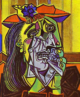


Weeping Woman With Handkerchief
(1937)
http://www.paintinghere.com/painting/Weeping_Woman_with_Handkerchief_2852.html

* What captures your eye about this image? What do you like about the image?
- Everything captures my eye, I like the colors and the Cubism.

* What visual elements (the basic things that can be seen)? What details are shown in the image? What do you see?
- There is a lot of cubism, and there's a woman and she is obviously sad.

* What colors are used in this image? What type of emotions do the colors portray? Where are the specific colors located on the image that give off a specific emotion.
- There is Green, Purple, Orange, Yellow, and Blue, these colors are supposed to represent sadness, they are everywhere.

*What are the specific Elements of Art (Line, Color, Texture, Shape, Form, Size) is being shown in this image?
- Cubism is basically what the whole piece is designed from, and the Texture appears to be smooth.

*What are the specific Principles of Design (Center of Interest, Balance, Harmony, Contrast, Directional Movement, and Rhythm) are show in the image?
- The weeping woman is the most important thing in this piece, cause she sets the tone for the whole art work.

* How will this work of art influence your own Picasso Portrait? What specific Elements of Art and Principles of Design on this work will influence your own work?
- I will use a whole bunch of bright colors and maybe some cubism.
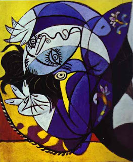


Girl On a Pillow
(1936)
http://timeisart.org/?p=90

* What captures your eye about this image? What do you like about the image?
- The woman sleeping on the pillow catches my attention, I like the colors.

* What visual elements (the basic things that can be seen)? What details are shown in the image? What do you see?
- I see a woman and she looks very tired lying on a pillow, cubism is shown in this photo.

* What colors are used in this image? What type of emotions do the colors portray? Where are the specific colors located on the image that give off a specific emotion.
- Picasso uses a lot of blue in this piece to express sadness, the colors are on the woman.

*What are the specific Elements of Art (Line, Color, Texture, Shape, Form, Size) is being shown in this image?
- Cubism plays a big part, and the angle of the photo makes you have to turn you head to find out what it is.

*What are the specific Principles of Design (Center of Interest, Balance, Harmony, Contrast, Directional Movement, and Rhythm) are show in the image?
- The woman is the most important thing in this photo and everything focuses on her.

* How will this work of art influence your own Picasso Portrait? What specific Elements of Art and Principles of Design on this work will influence your own work?
- I will make people turn there heads to see what my piece is about.


Thursday, December 1, 2011

Assignment #12 Organizing Your Presentation

1. Introduction

     A.  Attention-Getter
My plan to get the attention of my audience is to start my video off very dramatic and eye catching.  I plan to start my video off with the symbol of a dove which represents peace, there is also going to be dramatic music playing in the background. As the dove continues its flight it then begins to burst into flames, symbolizing the anarchy side of my topic. I plan to use slow motion too, cause everything looks cooler with slow motion.
    B.  Establish Credibility
I am qualified to speak on this topic because I have went out and did studies on the occupy movement. I have also interviewed individuals who are part of this movement. The information I have gathered is more then enough to give somebody viewing my documentary a understanding of the whole movement.
   C.  Thesis
The main topic that I am going to be covering is Anarchism vs Peaceful Protests. I wan't to go into detail on the effects of Anarchism and how it influences protests.  I want to show peoples views on anarchy and express how they feel about the topic. I also want to find out which one people think has a bigger impact on protesting.
   D.  Preview
The main points for my video will be Anarchy Vs Peace which one is more successful, Which one will help get the main structure of the movement across.

2. Body

    A. First Main Point - Anarchism
         1. I'll show the interviews I have with people covering this topic.
         2. I'll also show clips about anarchy in action, and the effects of it.
   
    B. Second Main Point - Peacefulness
         1. I'll show clips about the successfulness of peaceful protests.
         2. I'll show interviews about people talking about peace.

    C. Third Main Point - Peacefulness Vs Anarchism
         1. This is where I really go into detail about the main subject at hand.
         2. There will be clips, Interviews, and Narration from me about the subject.


3. Conclusion

    A. This is where things start to slow down and the dramatic music and clips come in.
    B. I bring up the main subject again and give my final comments on it, I'll probably quote something deep and meaningful.
    C. Credits roll in with some Credit Music.

Monday, November 28, 2011

Assignment #11- Documentary Film

I . History of Documentary Film
A. Pre-1900- They used to be called "Actuality" films, the term "Documentary" wasn't introduced until the 1920's. Most of the films weren't even over a minute due to the technology at the time. Many of the first films were made by Auguste and Louis Lumiere.

B. 1900–1920- The most popular types of film at the time were Travelogue films. Films about native americans were also very popular at the time. Early color films were also starting to be introduced.


C. 1920s- 

1. Romanticism - This era of film was all about romanticism, and a lot of actors used this in there films. Robert J. Flaherty a famous filmed at the time showed man 100 years earlier. They would actually kill animals for the effect in the movie.

2. The City of Symphony - These focused on humans the most, and the environments were made by humans. The point of them was to show people as products of there environment.

3. Kino Pravda- These kind of films featured varied lenses, shot- counter shot editing, and time lapse. Rendering was also easier during this film period.

4. Newsreel Tradition - These were usually staged and not real.  The would re-enactment events that had already transpired. They would film after things had already happened.

D. 1920s–1940s- This time period was full of propaganda films that were used to get people to believe something. The nazi's were very influential and used propaganda films to the extreme. The 1920's was a great time period for governments.


E. 1950s–1970s- Now that they had more technical advances they were able to do more stuff. The directors would take different viewpoints on there subjects. The shooting ratio for this era of film was very high standing at 80.

1) Cinéma-vérité- The would follow people around to capture more personal reactions. After they were finished filming editors would finish the film up. There were no sit-down interviews it was all in real time.

2) Political weapons- Documentaries were used as political weapons to put down and bash other types of government. It kinda of relates to the 1940's propaganda era where documentaries were used to put down other people. These films often showed the countries they portrayed in a negative light.

3) Modern documentaries- This is one of the most successful types of film in the modern industry. They are made with lower budgets then top notch films but are still successful. Modern day documentaries tend to show things in a different light then what people thought they were.

4) Documentaries without words- There isn't any talking or spoken word in these. They are still able to get there point across though. They can cover a large range of topics.

Thursday, October 27, 2011

Assignment #10


Purpose 
• What is the message that this document communicates? What is the
document’s purpose?
- It wants you to think about if your education is actually worth it.

• Why is it important for this message to be delivered to this audience at
this moment in time?
- Education is very important in or society today.

• How does the document communicate its message? Think about its
use of language, color, space, and symbols.
Audience
- There is a snake to get the attention of it, and big letters.
• Who is the audience for this document?
- Anybody who pursues a Education.
• What does the message suggest about the audience’s beliefs and
values?
- They question if the outcome of education is really worth it.

• How accurate are these beliefs about the audience?
- There not really accurate since it is there opinion.

Document Author 
• Who wrote the message?
-Unknown

• What are the writer’s motives for creating this message? How might
the writer personally benefit from the audience’s acceptance of this
message?
- They wan't us to think about all the stuff we are learning in schools and If it will pay off in the future.

Evidence, Support, and Outcomes 
• What facts and specific details does the document use? Are the facts
verifiable and believable?
- It is believable cause people go to school all there life just to end up without a job.
• What emotions does the document use to communicate its message?
- It uses a snake for fierceness.

How is the audience likely to feel when they read this message?
- They are likely to think about what is being said.
• What ethical or moral values does the document use to communicate
its message? What relevant values are not supported by this message?
- That education pays off.
• What will happen if the audience accepts this message?
- They might take a different approach to education.

• What would happen if everyone in the world accepted this message?
- There might be a lot more homeless people, or people not in school.

Overall Impression and Conclusions 
• What is the overall impression of this message? Summarize the details
that you have gathered in your analysis.
- My impression of this political poster is that it makes and interesting point, but it could use some more solid evidence and detail.

• How would you categorize this poster—argument, persuasion, or
propaganda? Explain your choice.
- I would call it an argument, cause they are going against education.


OMCA COLLECTIONS
http://collections.museumca.org/?q=collection-item/201054988


Purpose 
• What is the message that this document communicates? What is the
document’s purpose?
- If we should trust the government or not.

• Why is it important for this message to be delivered to this audience at
this moment in time?
- Yes cause the government has been doing some shady things.

• How does the document communicate its message? Think about its
use of language, color, space, and symbols.
Audience
- There is a scary image of a government individual.

• Who is the audience for this document?
- Anybody that is part of a country ruled by a government.

• What does the message suggest about the audience’s beliefs and
values?
- That they do not trust there government.

• How accurate are these beliefs about the audience?
- It can't really be proven, its just your own personal opinion.

Document Author 
• Who wrote the message?
-Unknown

• What are the writer’s motives for creating this message? How might
the writer personally benefit from the audience’s acceptance of this
message?
- He would have more people to back him up.

Evidence, Support, and Outcomes 
• What facts and specific details does the document use? Are the facts
verifiable and believable?
- It uses the fact that government agents do look scary.

• What emotions does the document use to communicate its message?
- It uses fear.

How is the audience likely to feel when they read this message?
- They will think about it and be kind of scared.

• What ethical or moral values does the document use to communicate
its message? What relevant values are not supported by this message?
- That the government is here to protect us.

• What will happen if the audience accepts this message?
- They will turn against the government.

• What would happen if everyone in the world accepted this message?
- We might have a world wide revolution.

Overall Impression and Conclusions 
• What is the overall impression of this message? Summarize the details
that you have gathered in your analysis.
- It makes me think that if our government is really here for us, why do they wear masks and do shady things in the shadows.

• How would you categorize this poster—argument, persuasion, or
propaganda? Explain your choice.
- I say propaganda cause it is bashing a group of individuals, and trying to make people hate them.

Friday, September 30, 2011

Assignment #6- Pablo Picasso Cubist Painting Upload Portrait


Beyond The Brush Stroke
Picasso was more then a man, he was pure inspiration. The art work that he created

will forever be a part of history. His masterpieces showed art from a whole different perspective then what was normal for most people. He used many different elements of design such as Line, Color, Shape, Value, Texture, and Space. His style of art work really influenced my art piece and I incorporated some of his pizazz into my photo shop Picasso piece. Thank’s to his artistic skill I was able to turn my art piece from something boring into something unique.

By studying some of Picasso’s great work, I was able to pick what kinds of style I would work with. I worked with photo shop and used all the tools that it provided, such as the brush and it’s warping feature. I used these to give my piece a kind of distorted perspective look, It doesn’t look like a normal painting. When I started I wasn’t really sure what it would end up looking like but I'm satisfied with the final result. I hope my piece makes people think harder then when they look at regular paintings.

The project assignment was to create a Picasso piece similar to the ones created by the one and only Pablo Picasso. I didn’t really start with a vision, as my piece progressed, I began to develop ideas on how I wanted it to end up. I decided to base the final look of my piece on my hope’s and dreams and the inner workings of my complex mind. I think the final look shows the wonder and complex thinking that I am capable.

The mood that im trying to get across in my painting is one of wonder and amazement,
I want people to look at my piece and feel completely lost. That's why I made it look like I'm floating in space. I used bright colors such as green and yellow you express how happy I am in life. I don’t have any sad colors cause I am rarely ever sad in life. The stars represent what I am shooting for in life, my goal in life is to be a star and to be recognized by every single person in the world. I think I did a good job of expressing my self in my Picasso art piece.

Picasso was more then a man he was pure inspiration, there will never ever be another person like him. It’s great to see that his artwork still influences people to this very day, like it influenced me. I hope other people will follow his example and make art that will help express themselves. Picasso may be gone but his Inspiration is something that will live on forever through his art.


Victor Lewis

Period 6 Visual Communications 10/25/11

Assignment # 5- Elements of Design

The basis of all design is the arrangement of the elements of a work of art, using the design principles. It is the bringing together of various components into one area and arranging them in such a way as to create a composition, layout or design that is both unified and pleasing to look at. For example every artist whether they realize it or not is familiar with the elements of design.

Directions: For each of the Elements of Designs, you will research online of an image that represents each of the elements. Cite and label each of the elements.

• Line - an actual or implied mark, path, mass, or edge, where length is dominant
                                    http://www.etftrends.com/wp-content/uploads/2009/01/31_train_track.jpg

• Form - the mass of the shapes
                                         http://socialmediaforsmartpeople.com/wp-content/uploads/2010/04/meteor.jpg


• Texture - the structure and minute molding of a surface (rough, smooth, etc.)


• Value - the degree of lightness or darkness of a given color


• Color - a pigment


• Shape - any flat area bound by line, value, or color


Thursday, September 22, 2011

Assignment # 4: Pablo Picasso Webquest

1. What is his full name? Pablo Die

go José Francisco de Paula Juan Nepomuceno María de los Remedios Cipriano de la Santísima Trinidad Ruiz y Picasso http://en.wikipedia.org/wiki/Pablo_Picasso


2.When was he born? October 25, 1881 http://en.wikipedia.org/wiki/Pablo_Picasso


3. When did he die? April 8, 1973 http://en.wikipedia.org/wiki/Pablo_Picasso


4. Find out the names of his parents,brothers or sisters? Father: Jose Ruiz Blasco


Mother: Maria Picasso Y Lopez


Sisters: Lola(Born 1884), Conchita(1887)


5. What were the names of Picasso´s wives or lovers? What were their nationalities? Olga Koklova - Russian


Jaqueline Roque - French


7. What are his children and grandchildren´s names? Paulo, Maya, Claude, and Paloma


8. Which topics did he paint about? Peoples Distorted Portraits, Images of Women/Lovers, Nudes, Politics, Still-Lives


9.Why did he go away from Spain? Where did he live? To Expand his Art he moved to Spain.


10. In which way did he influence the concept of painting? He made abstract images that were hard to decipher, and made people wonder what they were about.


11. Main events that influenced his life? Women and the war influenced his complex aproach to his art.


Find a Cubist Painting by Picasso (not a self portrait). Upload and site this image on your blog along with the name of the painting and date it was painted.


Les Demoiselles d'Avignon (1907)

http://en.wikipedia.org/wiki/File:Les_Demoiselles_d%27Avignon.jpg


12. Describe some people, objects, and/or animals in his paintings(what they look like,the clothes they are wearing,their personality). He paint's a lot of pictures of Women, probably because they were a main factor in his life. He had a lot of affairs in his lifetime, there is nudity in his paintings and his figures are posing very sexually suggestive.

He paints a lot of women and there all naked, Picasso had a thing for Nudity.


13. Is there anything special about the people´s faces or bodies? Picasso uses distortion in his images so it's hard sometimes to tell what his image is about.

The faces for his drawings look like african tribal masks, It is safe to assume that he was influenced heavily by african art.


Assignment #3

Business Sign


Image A

Image B

1. These two signs are advertising fast food restaurants, there letting people know the name of there establishment and what they can expect to buy there.
2. 
    Sign A- Has bright colors in order to catch the eye of potential customers, the name of the sign says Burger   King which is to get the Idea to everyday people that you can expect top of the line burgers from this restaurant.
    Sign B- Bright red and yellow colorway to get the attention of potential customers, the name of the restaurant is placed in a giant burger, there intention is to make people think they sell huge burgers.
3. My eyes would be drawn to Hungry Jack's advertisement first because it is bigger and easier to spot.

Clothing / Shoe Company 

Image A
Image B
                                              http://images.sneakernews.com/wp-content/uploads/2008/10/lakai1.jpg

1. There showing the products of there company's, these are what there shoes look like and they want people to like them so they can purchase it.
2. 
    Picture A - Low top with a cream color and red paint splatter for the design, the shoe is called the Nike SB (SkateBoarding) Stefan Janoski and it has a very sleek look.
    Picture B - Also low top with suede texture, black and white colorway with a sleek look, it is called the Lakai Manchester Select.
3. My eye would be drawn to the Nike SB Stefan Janoski just cause nike is more known and I like the design better then the Manchester.
   

Assignment #2: "iPod"Silhouette Photoshop project


Assignment #1: The History of Cave Paintings

                                                              http://www.oddee.com/item_93915.aspx
I picked this cave painting because it's really simple and you are able to get a sense of whats going on really fast. It shows how life was back then, where you actually had to go out and hunt for food in order to survive. This painting makes me respect how hard life was for them back then.

                          http://kids.britannica.com/elementary/art-75972/Cave-paintings-in-Chad-give-scientists-clues-about-the-people


This is a ancient Chadian cave painting found in Chad. I chose this painting because It is a peaceful one, It shows people and animals getting along with each other. Are ancestors way of life back then was way more l peaceful then ours everybody was able to co-exist with each other and they all got along.


1. What are cave paintings?
    -Paintings done on the walls of caves by a ancient civilization.

2. How old are the oldest paintings?
    -The oldest rock painting is estimated to be about 40,000 years old.

3. When the Europeans first encountered cave paintings, why were they believed to be a hoax?
     -It was hard to believe that early humans were smart enough to draw pictures on walls.

4. Why are cave paintings important to study?
     - Cave paintings are important to study because it will help us get a understanding of our ancestors past life.

5. What were the common themes that these painting showed?
     - They showed a lot of wild life, and basically the culture of the time and how they lived.

6. What were the Shamans Thought of doing in the caves?
     - They liked to submerge themselves in the darkness and paint images.